We were tasked with creating a proposal for an expansion team, and we decided on the Las Vegas Royals. We wanted to connect the importance of the Strip to the community. All the Las Vegas teams have received immense support and success. Based on our research, we think an NBA franchise will be welcomed the same and add to the uniqueness of Las Vegas. It only makes sense for the “Entertainment Capital of the World” to have one of the most entertaining sports call the city home as well.
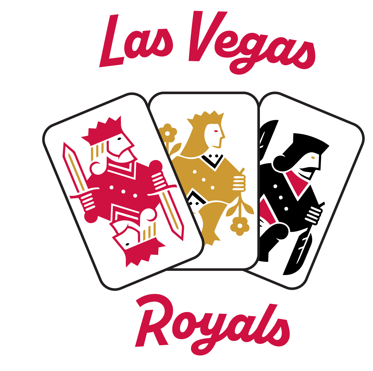
For our logo, we decided to use the king, queen, and jack cards that make ups he royal cards in playing cards. All three cards have a modern design to them, but are accented by a more classic looking font that calls back to the heritage and history of Las Vegas, but the font also has some modern elements as well. We also used the Las Vegas Aces colors to connect us with their existing brand in the city, as well as connect the two franchises together similar to the Phoenix Mercury & Suns or the Los Angeles Lakers & Sparks.
Logo Design
Uniform Designs
Our uniform mock-up are representative of Las Vegas and all of its features. The Association and Icon feature a red to black gradient to represent the Las Vegas sunsets and the Icon also features the skyline of the city. Our Statement and City jerseys Also pay homage to an iconic part of the city: The welcome sign.
This campaign was created for a class project at the University of Oregon. These were my responsibilities for the project.


